
Power BI - The basics
- arebera
- Sep 10, 2018
- 2 min read

Updated: Sep 11, 2018
This is the very first tool I learned when I started my journey as a Data Analyst / BI Developer. The ability of Power BI to create user friendly, interactive reports and dashboards is just the icing on a delicious gateau. It is rich in features and Microsoft releases regular updates implementing new and better functionalities based on the feedback from a large base of Power BI users. From a high-level perspective, the components of Power BI could be divided into - gathering data, modeling data and creating visualizations.

As easy as it might sound, there are many processes involved in each of these components. Power BI supports a large variety of data files like Excel, flat files, different types of databases, cloud, real time data, Hadoop etc. and the list keeps on increasing.

Data modeling essentially means finding and establishing relationship between data entities and attributes. Power BI's relationships component aids in creating relationships between the different entities. Most of the times Power BI could do this automatically (especially if the attribute name is same in the different entities) or the user can easily establish relationships with a 'click-and-drag' of the mouse. My personal experience is that the functionality and accuracy of a report has its foundation in the strength of the data model. If the entity relationship is broken or inaccurate, then the reports thus generated would also be inaccurate and useless.
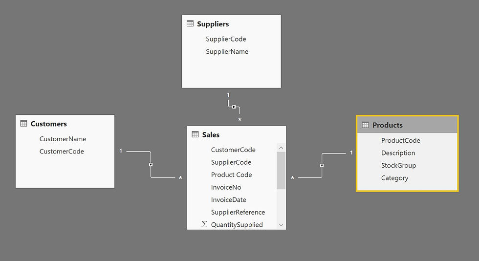
Power BI allows creation of one-to-one (1:1), one-to-many (1:*) and many-to-one (*:1) cardinality between entities and single & both cross filter directions. I will write more about cross filtering in a future post. Once we have the data loaded and the relationships established, it is now possible to build meaningful reports that can be used to drive business decisions. Power BI offers a wide range of visualizations to choose from, while there are also interesting custom visualizations created by users available for download online.
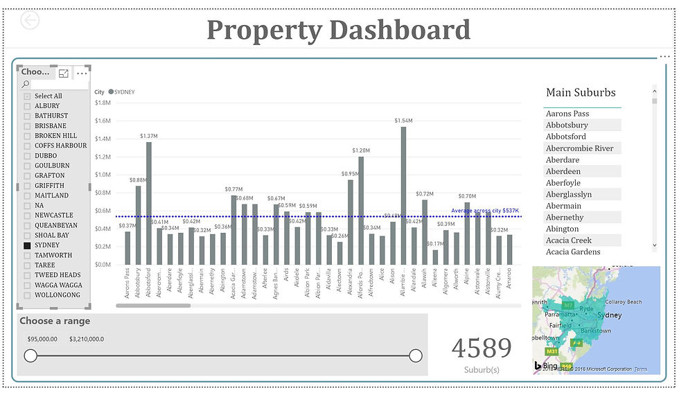
The above report contains 5 different types of visualizations - filters for slicing and dicing, bar chart, card, table and filled map. Like I mentioned before, this is just an overview of what Power BI is capable of. The more you interact and practice, the more you learn!!!


Thank you so much for sharing your knowledge and help understand the basics.