
Cross-filtering
- arebera
- Oct 2, 2018
- 1 min read

This feature in Power BI plays a crucial role in enabling the report user to interact with the report. It allows the report designer to plan how the different visual elements in a report interact with each other. Different visualizations have different cross-filtering options.
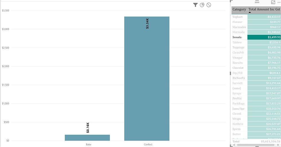
For example, in the report below, when designing the interaction of the table on the right with the bar chart on the report, the following options are available.
- Filter
- Highlight
- None
These can be seen on the top right hand side of most visualizations. This option can be edited by clicking on the visualization and selecting Edit Interactions in the Format tab of Power BI Desktop.

The Filter option shows only the details corresponding to the currently selected item in the right table. For example, if I choose Sweets in the table, the bar chart shows data related to this selection only.
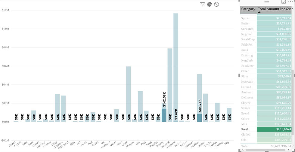
On the other hand, the Highlight option shows the whole chart with the selected item highlighted while the others are displayed in a lighter shade. In the below example, the highlighted bars (Poultry, Seafood) corresponds to the category selected on the right (Fresh).
As the name suggests, the None option doesn't change the visualization based on other elements in the report.


Comments